March 20, 200521 yr To late now I vote both, even though i voted signatureP.Son the sticker the logo is a purple, on the cone its orangeIMO, the purple looks cooler
March 20, 200521 yr To late now I vote both, even though i voted signatureP.Son the sticker the logo is a purple, on the cone its orangeIMO, the purple looks cooler<{POST_SNAPBACK}>adjust the color on your monitor.....the logo on the sub is red i voted logo, cause thats what i got
March 20, 200521 yr adjust the color on your monitor.....the logo on the sub is red i voted logo, cause thats what i got <{POST_SNAPBACK}>Sorry, but the logo is definitely orange.
March 20, 200521 yr adjust the color on your monitor.....the logo on the sub is red i voted logo, cause thats what i got <{POST_SNAPBACK}>Sorry, but the logo is definitely orange. <{POST_SNAPBACK}>huh, i swear mine is more red than orange
March 20, 200521 yr huh, i swear mine is more red than orange<{POST_SNAPBACK}>Weird. Mine is very orange.But no two people see exactly the same thing, so...
March 29, 200521 yr I like the sig mucho. I think I may get an RL-p or two when I get some money this summer.
March 30, 200521 yr Would prefer if people had a choice...but if it came down to it, the naked aluminum with the sig or no sig would be the way to go.
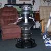
March 31, 200521 yr I'm starting to think the same JF.I've always liked the sleekness of a blank cone - but I'm also proud of the logo I made damnit! Initially, I had planned on the logo being printed in a gloss black on the matte black cones, for a very subtle effect (which I may still try at some point). But then I saw this Pantone 876C color, which is a sweet metallic copperish color. Unfortunately, during printing the ink reacted with the paint on the cone and it lost its nice metallic shimmer.. which is why the end product looks more orange than copper. Ah well, you live and learn!Thanks for the input everyone - keep it comin'
April 5, 200521 yr I'm starting to think the same JF.I've always liked the sleekness of a blank cone - but I'm also proud of the logo I made damnit! Initially, I had planned on the logo being printed in a gloss black on the matte black cones, for a very subtle effect (which I may still try at some point). But then I saw this Pantone 876C color, which is a sweet metallic copperish color. Unfortunately, during printing the ink reacted with the paint on the cone and it lost its nice metallic shimmer.. which is why the end product looks more orange than copper. Ah well, you live and learn!Thanks for the input everyone - keep it comin' <{POST_SNAPBACK}>Can you still do the gloss black logo? If so, put that on the new cone the affect would be better. I want three of the rl-p 15's bad .
April 5, 200521 yr > Can you still do the gloss black logo? > If so, put that on the new cone the affect would be better.For now I'm going to keep it simple and sleek with non-logo'd drivers. The printer just takes too long. I may at some point give the gloss black a shot, but now that I'm using the slightly textured annodized cones, I'm not sure that I would like it as well as the matte versus gloss contrast. At any rate, thank you for your input
April 6, 200521 yr i like the look of the sub on the right but if it was all black http://www.icixsound.com/vb/showthread.php?t=11041
Join the conversation
You can post now and register later. If you have an account, sign in now to post with your account.